Behind the Build: Reimagining a Community Platform from the Ground Up
How we created a community-driven hub that empowered users to connect, contribute, and co-create with a playful UX and a scalable foundation, as a team.
What do you get when you combine a passion for self-served demo customization, a growing network of Solution Engineers, and an aging platform struggling to keep up? An opportunity. One I embraced as the UX architect, leading a team of junior designers and engineers to reinvent the experience from the ground up—for both creators and consumers of demo components.
🤔 Challenge to Solve
How might we offer a user experience that encourages participation, facilitates discovery, and makes contributors feel proud of their involvement?
We knew the challenge wasn’t just about features. It was about cultivating a sense of belonging, helping users feel empowered to share their work, discover relevant content, and connect with others in meaningful ways.
🥾️ Path to Solution
Listening First
We started with interviews and community surveys. Creators felt friction at every step: publishing was clunky, profiles were impersonal, and the system didn’t reflect their efforts or foster discovery.
Designing with Roles in Mind
We designed for three core personas:
- Contributors who wanted a smooth way to share and track their work.
- Visitors who came to learn, explore, and maybe become contributors themselves.
- Community Managers who needed oversight, analytics, and moderation tools.
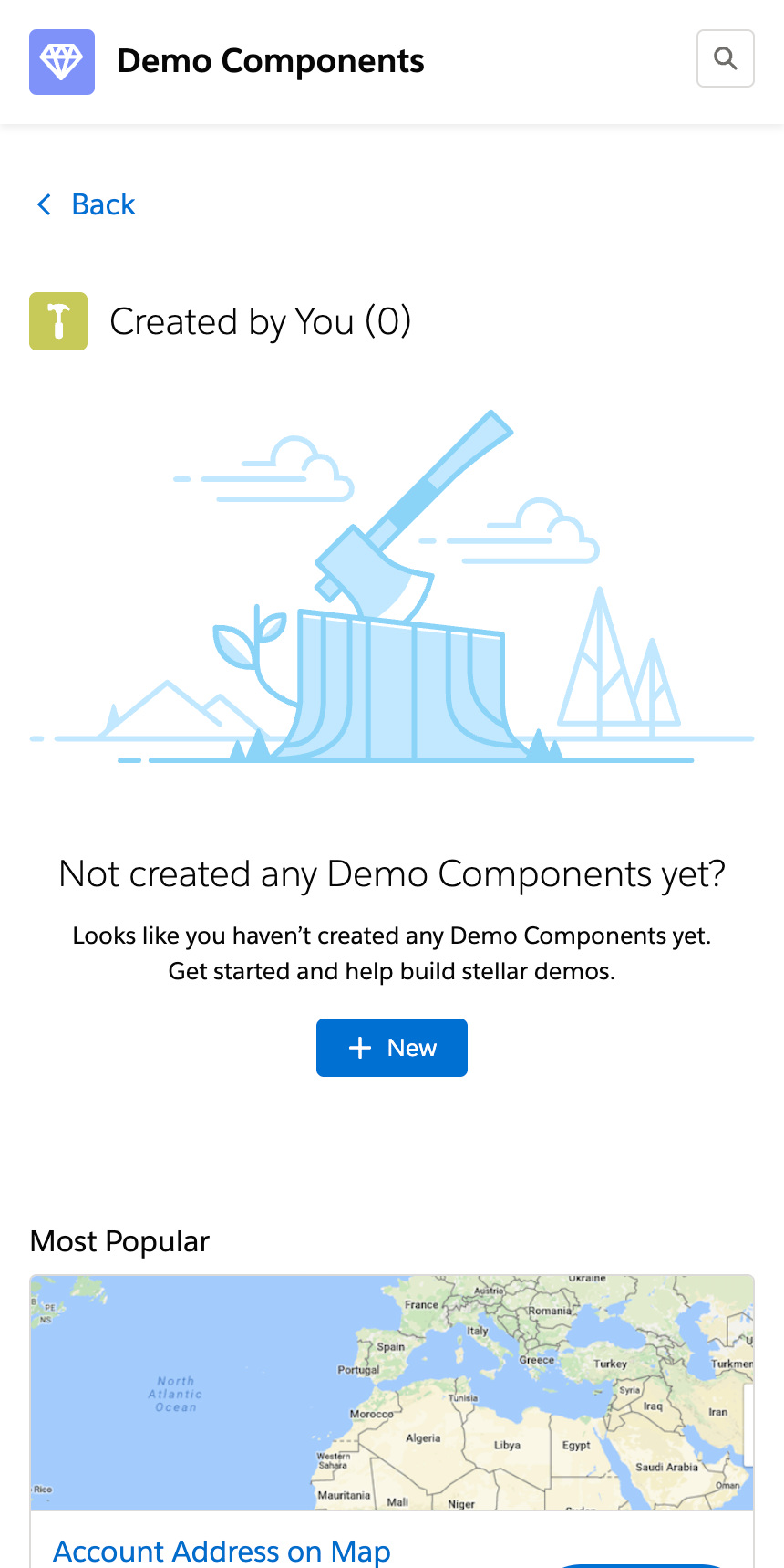
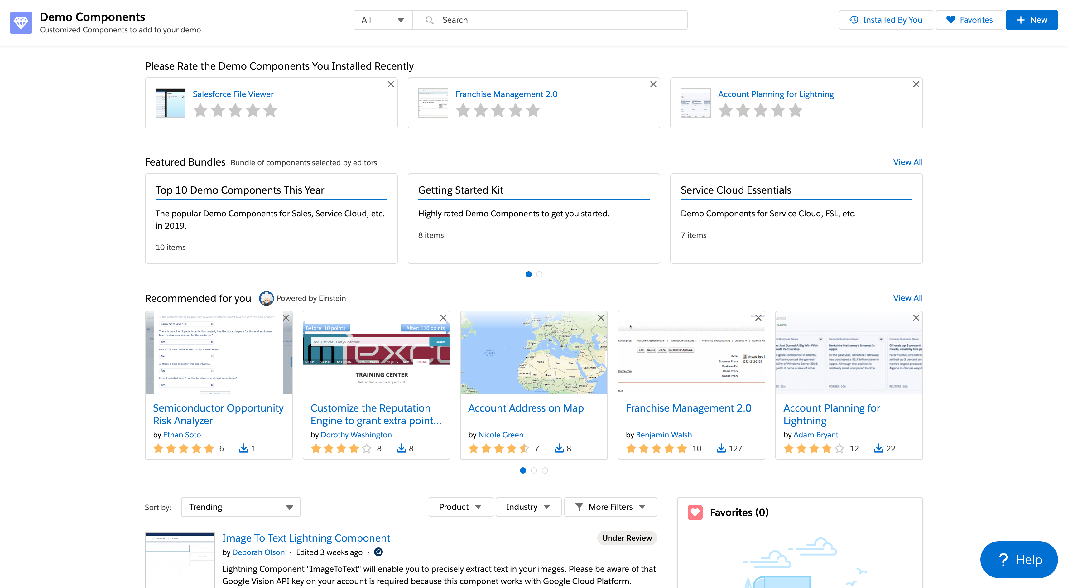 New demo components homepage — Solution Engineers land on a sleek, centralized hub where all demo components and resources are organized for quick, effortless access, setting the stage for smooth demo preparation.
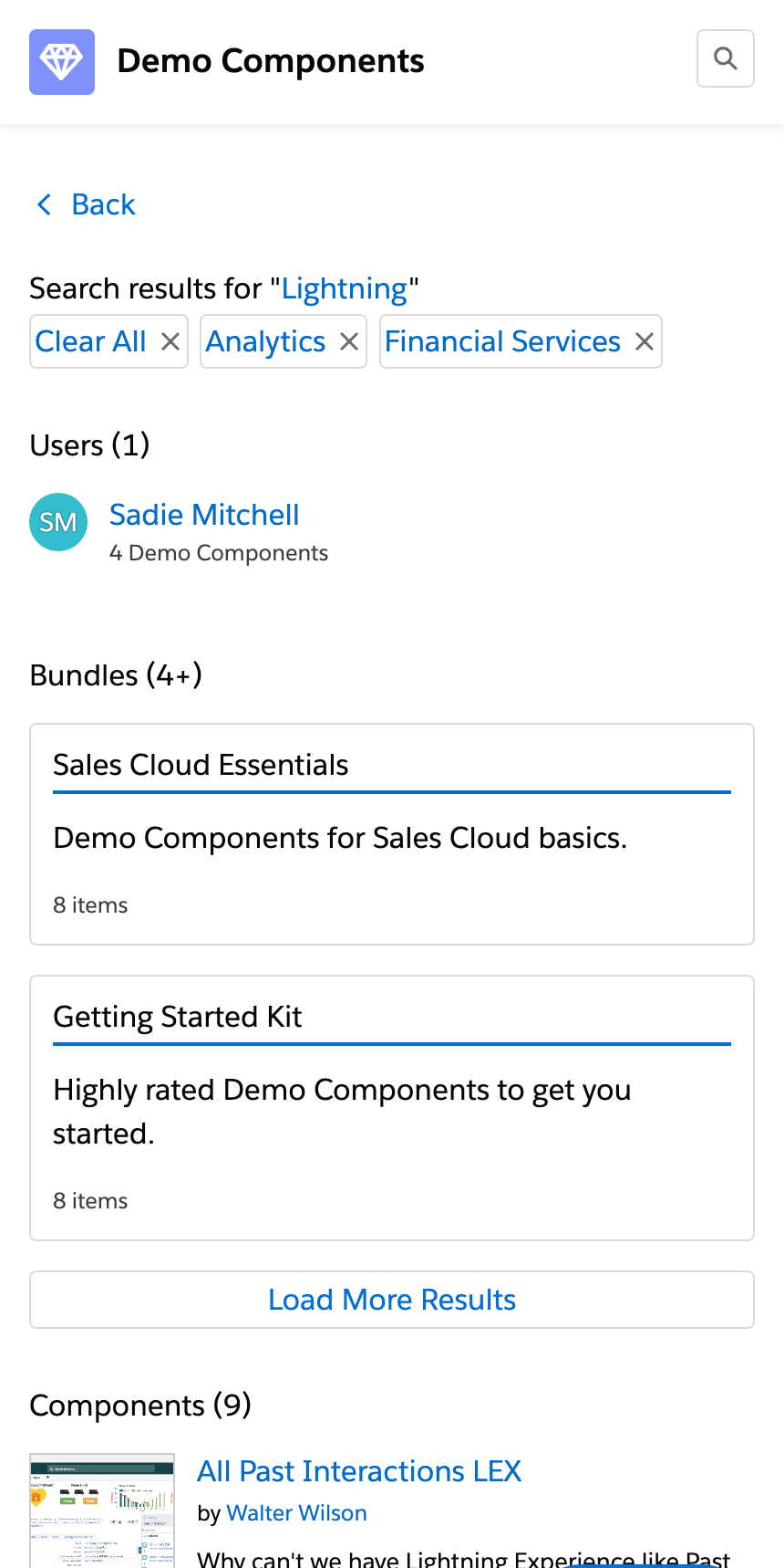
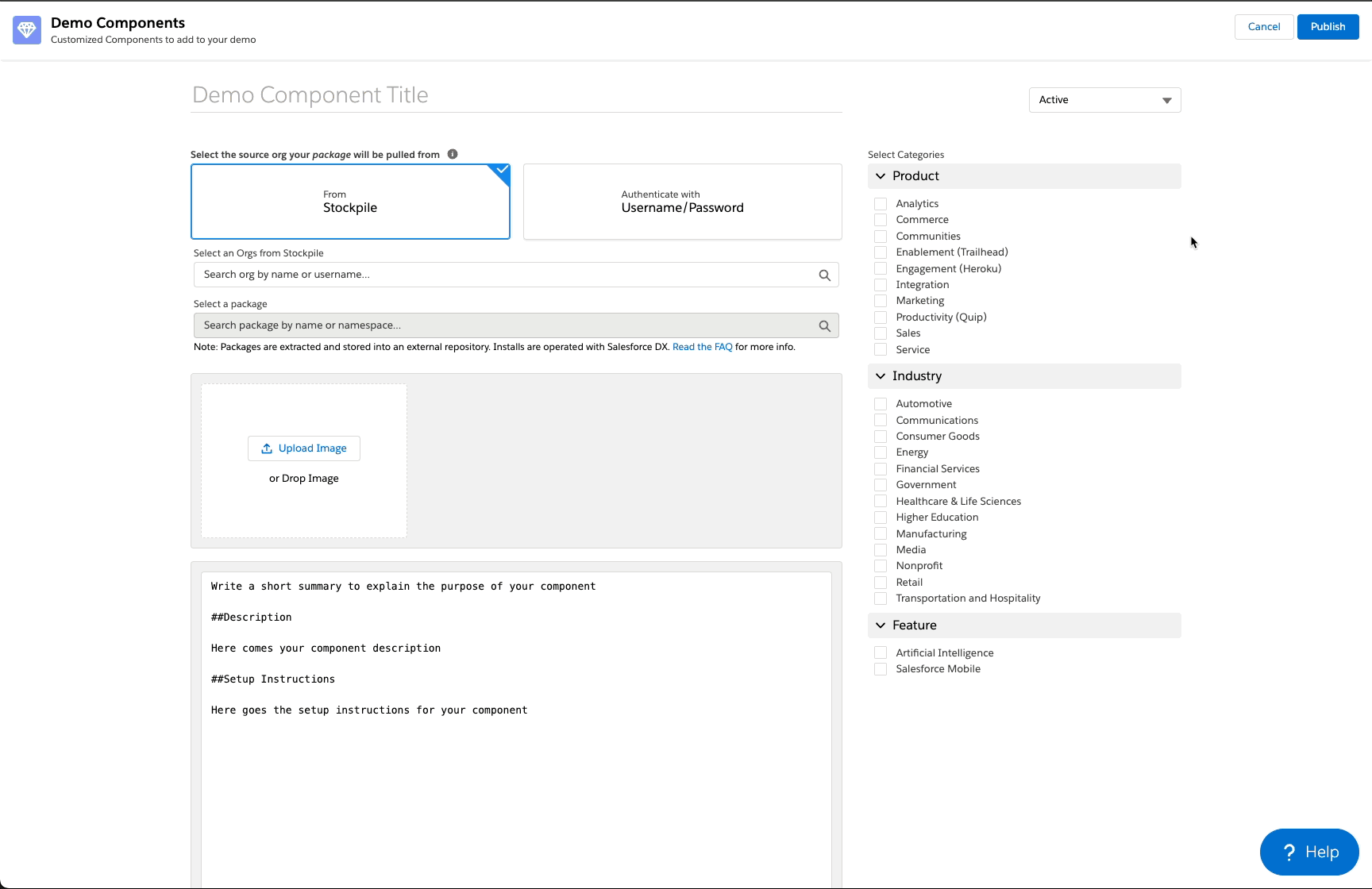
Enhancing Content Accessibility with a Robust API Layer
To enhance scalability and maintainability, we transitioned to a microservices architecture. This allowed individual components to be developed, deployed, and updated independently, fostering innovation and reducing interdependencies.
Elevating the Community Feel
We focused on micro-interactions and content discovery:
- Celebrated contributor profiles.
- Surfaced most loved and most helpful content.
- Added commenting, reactions, and content suggestions.
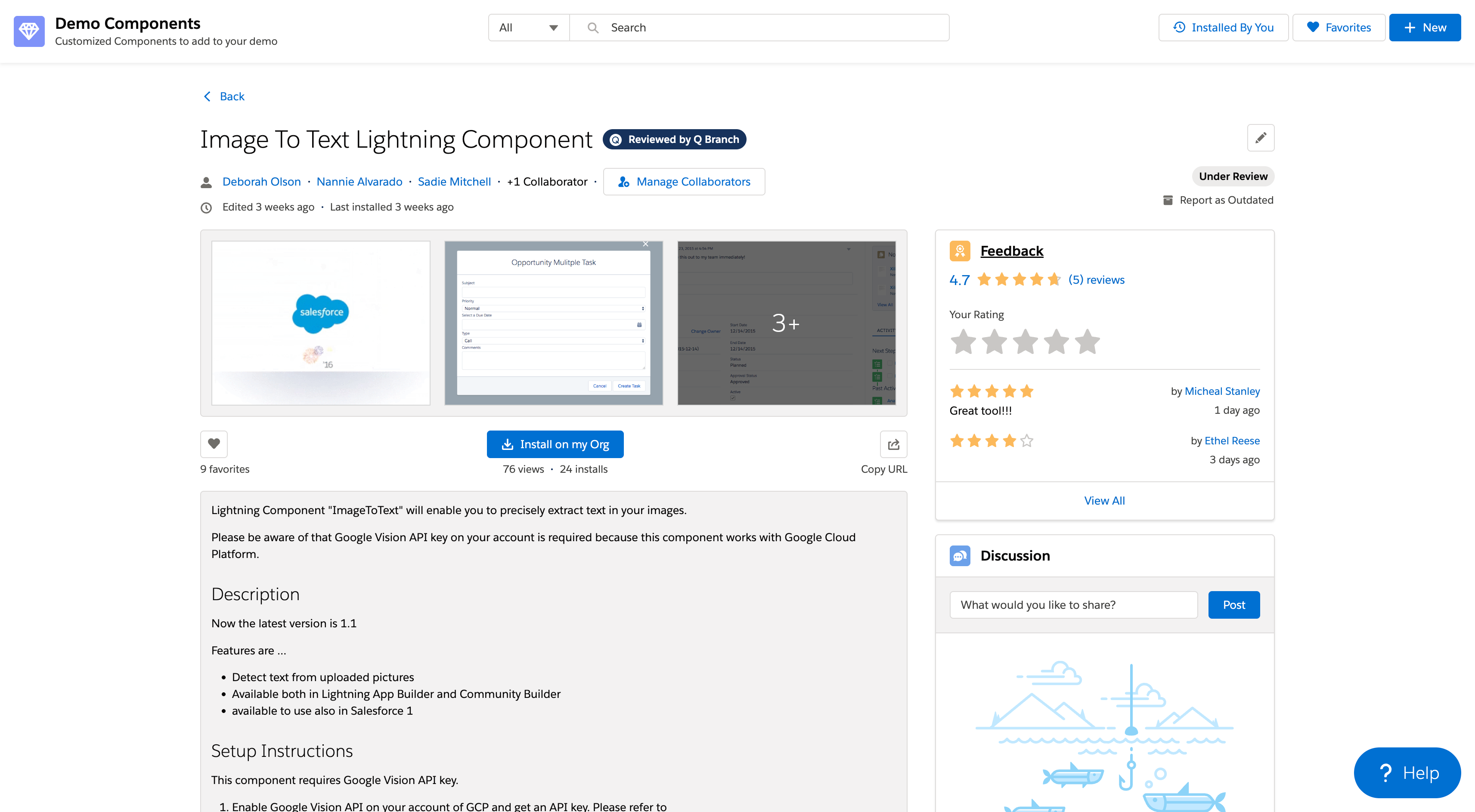
 Celebrating contribution with micro-interactions — Small but powerful animations and feedback moments that make contributing feel rewarding and engaging, turning everyday actions into delightful experiences.
🚀 Outcomes That Speak Volumes
This was our first full end-to-end design project at Salesforce, led by a young, dynamic team hungry for impact. The results? Clear and compelling:
- Doubled contributor engagement within just two months, fueling the growth of a vibrant platform with over 8,800 active users, each one empowered to share, explore, and build more effectively.
- Reduced content publishing time by 40%, streamlining workflows and automating moderation to get high-quality components out the door faster.
- Increased content discoverability by 60%, thanks to improved search engine and a cleaner content structure which helped drive over 41,000 component installs just a couple years in.
- Reduced content management overhead significantly, empowering the newly formed support team with moderation tools and automation keeping 960+ components actively maintained without burning out the folks behind the scenes.
📚 Key Learnings
- Designing mobile-first promotes clarity and simplicity. It highlights essential information and naturally leads to structures that are easier for users to navigate, resulting in cleaner, more effective designs.
- It takes a village to build, launch, support, and evolve a product. Orchestration hinges on strategic alignment getting the right people moving in the right direction at the right time.
- Keeping the end user front and center isn’t just a design principle, it’s a critical driver of success. When teams align around user outcomes, decision-making sharpens, priorities become clearer, and products deliver real impact.
🧩 Final Thoughts
Building this platform wasn’t just a technical upgrade. It was about turning a quiet content site into a buzzing digital town square. It worked because we put the community first and gave them the tools to thrive.